Designer Insights | In Defense of Apple's Smart Battery Case

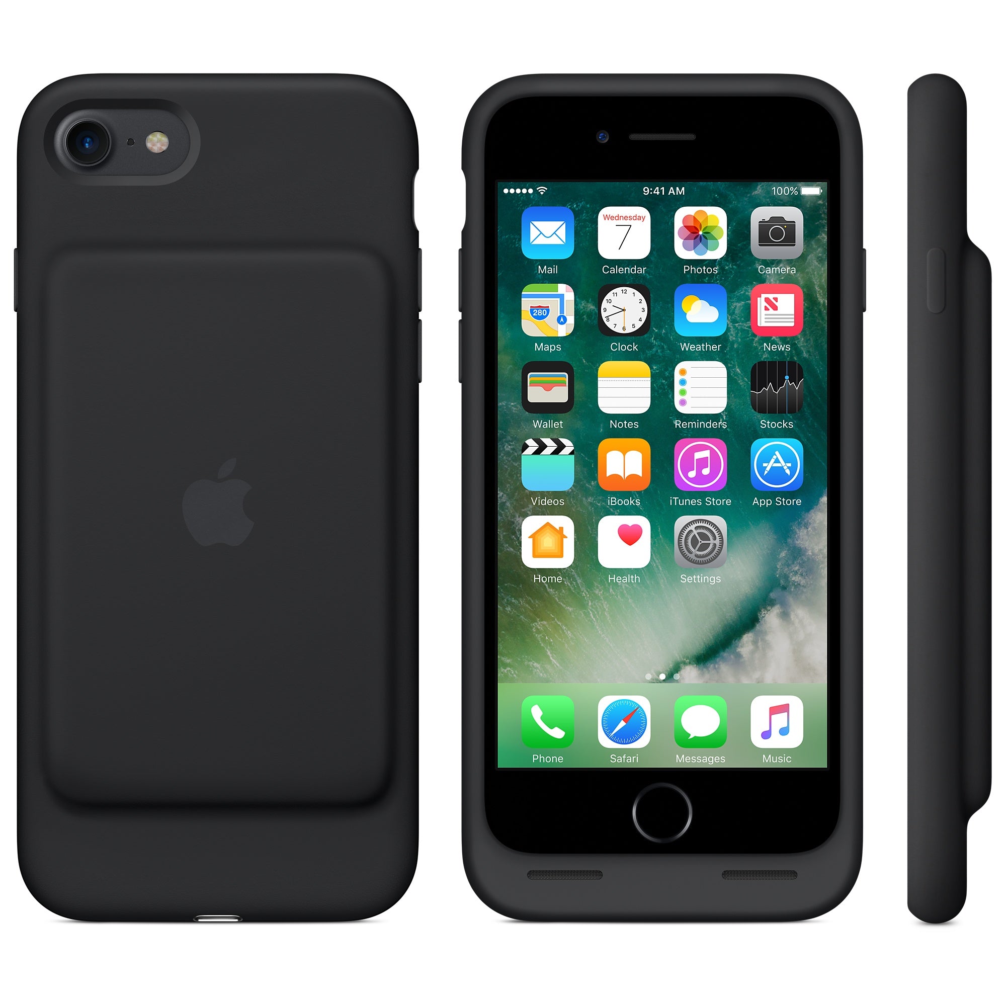
As a product designer, a simplified requirements list of my job is to design products that look good enough to sell well, can be manufactured, and function. Concerning function, Apple hit it out of the park here. The soft construction is brilliant because it allows added protection with shock absorption, simplified manufacturing and easy removal and unibody design which makes it seamless. You see one surface and not a mix of parting lines or different materials. It also fits in your hand a lot easier because the volume is not carried over to the edge of the phone. There really is no good functional reason to fill in the rest of the volume with plastics. Some may argue that there is an aesthetic need for it but when faced with compromising function, I'm usually on the side of function.
I've faced these same issues when designing battery cases and ended up with the typical polycarbonate construction. Years ago, I saw an example of the soft construction on a visit to a factory and was enamored. It only had a soft top but it made for a much better experience. I hadn't considered anything soft because I assumed the rigidity was required for the protection of the battery. At the time, slider cases, as we called them, were in vogue. They required sliding your phone instead of popping it in. This was before we realized they often scratch your phone.
About the only additional function we were able to add with this design was the stand and redirecting the sound from the bottom speaker toward the user. I can't say I'm all that proud of it. It looks rather bulky now but it had some nice details I was proud of then. This, by the way, is pretty typical for any designer looking back. There are always improvements to be made and you're rarely satisfied with the final product.
One of my favorite designs that I did was one we called the JumpStart. It has since been copied but it had some real advantages over other battery packs out there in that it fit with the case you already had or no case at all. When you were done with the battery, you could remove the bulk from your phone. The disadvantage to a removable pack is that it is removable. Are you really going to remember to charge it separately? We're all pretty lazy creatures.
Apple has taken away most of the bulk associated with battery cases, added pass through smart charging and therefore given you a case that you really don't have to take off. It still fits in your pocket as well as most any cased phone.
Because of this function, I find the case has an inherent beauty. I see the "hump" not as a mistake or oversight but as a result of efficiency and a consideration of the hierarchy of needs. They didn't compromise by adding unnecessary bulk for the sake of "sleek" lines. It could be argued that none of the battery cases out there are beautiful so why not maximize function?
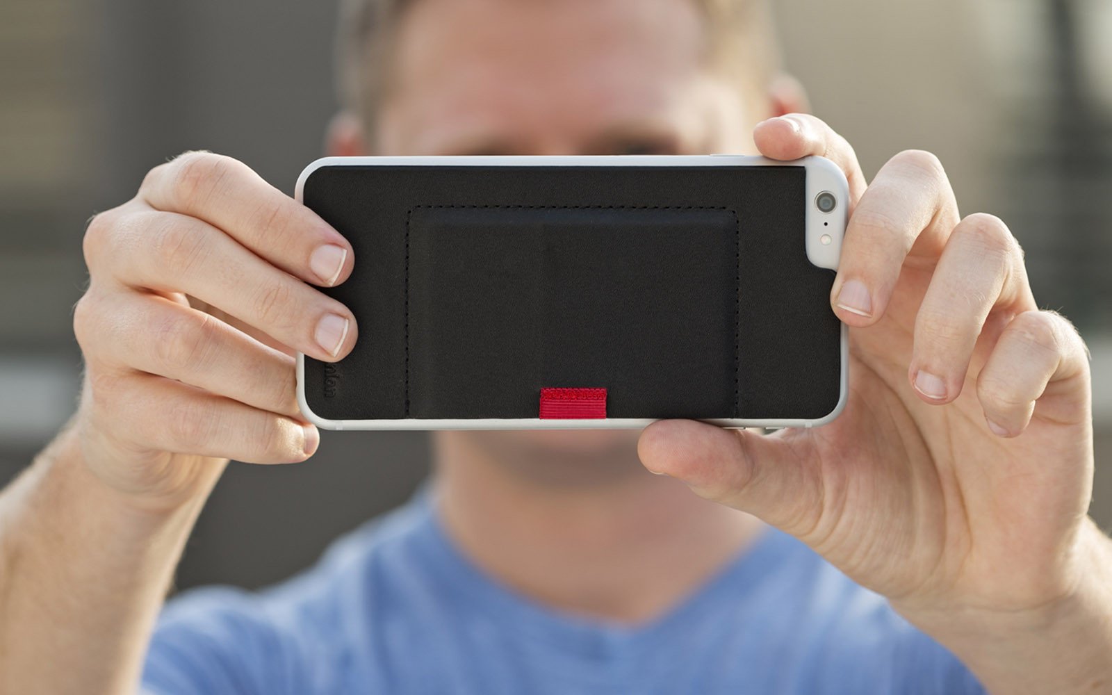
In full disclosure, I actually designed something that looks similar to Apple's battery case so you're welcome to take that for what it's worth. When I first saw Apple's battery pack, I did do a double take because it looked like Apple was getting into the wallet case game. If they had, our Wally would be over.


